Today, this type of graphic design is widely known as Swiss style. This is because a group of talented designers from Switzerland contributed a lot to developing and promoting it in architecture, art and culture in the 50s last century. The endeavor had a significant effect on graphic designs used in frames of the modernist movement.
However, the truth is that this artistic style, also known as the International Typographic style, had emerged long before the Swiss designers stepped in. Germany, Netherlands and Russia are worth mentioning as true origin countries; and this happened as far back as in the 20s last century, Nevertheless, Swiss Style has become the most popular name for the phenomenon and is used worldwide now.
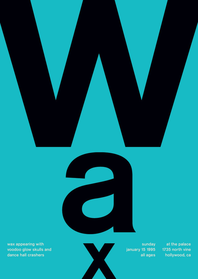
Let’s take a closer look at its characteristic traits and discuss how you can apply its concepts when it comes to poster designs. While the Swiss style and Swiss poster design are as topical today as several decades ago, understanding the basics can help contemporary artists a lot.
Swiss Style Design: Major Characteristics
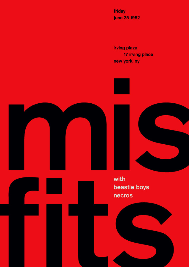
In short, the graphic design style under discussion can be boiled down to just a few basic principles: objectivity, readability and cleanness. Actually, this is a combination of exquisite aesthetic traits and functionality. To dissect it further, the following elements are characteristic to Swiss Style graphics:
- asymmetric layouts;
- use of a mathematical grid;
- ragged right text;
- flush left;
- sans-serif typefaces;
- simplicity;
- use of photography rather than drawings;
- geometric abstraction;
- functionality dominates the form.
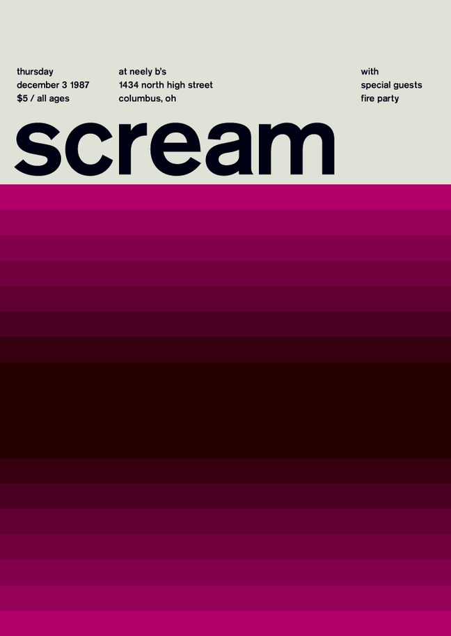
The layouts are crispy and precise. Sans-serif fonts add to minimalism of the designs. The idea is that removing any unnecessary elements helps avoid mess and highlight only what really matters. This is an infallible way to deliver information in a structured and as readable as possible way. This is the case when the classical phrase “less is more” applies perfectly. To design a Swiss style poster, create it as you like and then take away, step by step, everything that can be removed without loss of the underlying message. In the end, only the most expressive elements would remain.
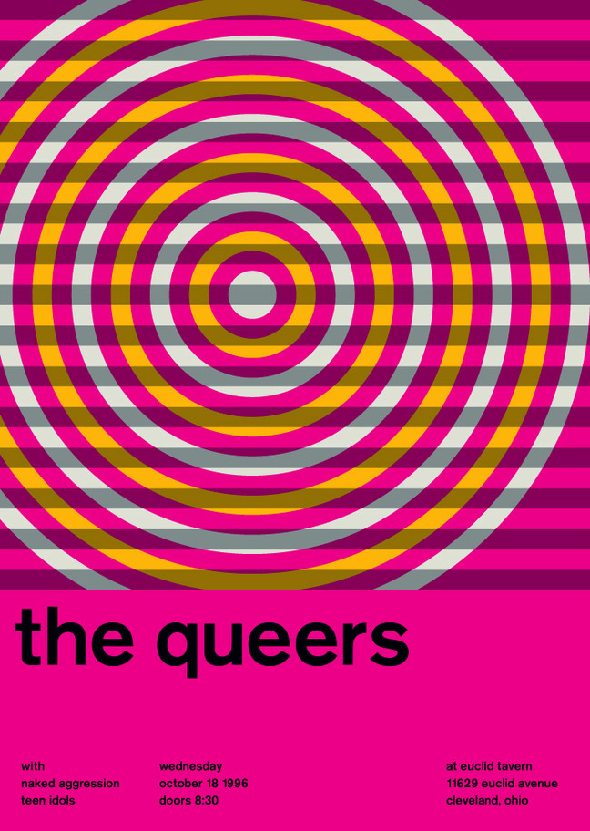
This creative work also requires a change in your mindset. Despite what many people may believe, minimalism is not an easy thing to follow. Once mastered, this approach allows expressing more with fewer elements and focusing a viewer’s attention on the most important and relevant things you want to say. Consider visiting our collection of 3d wallpaper and other poster backgrounds to find a source of inspiration.
Swiss Style Design: How to Create a Poster
Below, some practicable guidelines are provided to help you create your own Swiss style poster design.
Functionality dominates the form
Getting down to designing a poster, make sure you incorporate into it a clear point that you want to focus a viewer’s attention on. This tool is necessary to facilitate conveying the poster’s main idea to your target audience. Feel free to break classical composition rules as functionality supersedes.
Use a mathematically distinct grid
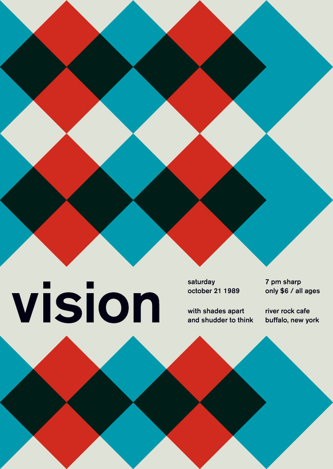
A clearly ordered composition can render your poster pleasing to the eye. Using a grid is the right method to achieve the effect. Additionally, this helps make your poster look more logical by grouping or separating certain elements. If you feel more elements should be added, adhere to the assumed grid to keep the general structure consistent. Minimize the number of content items to avoid mess.
Use asymmetrical layouts
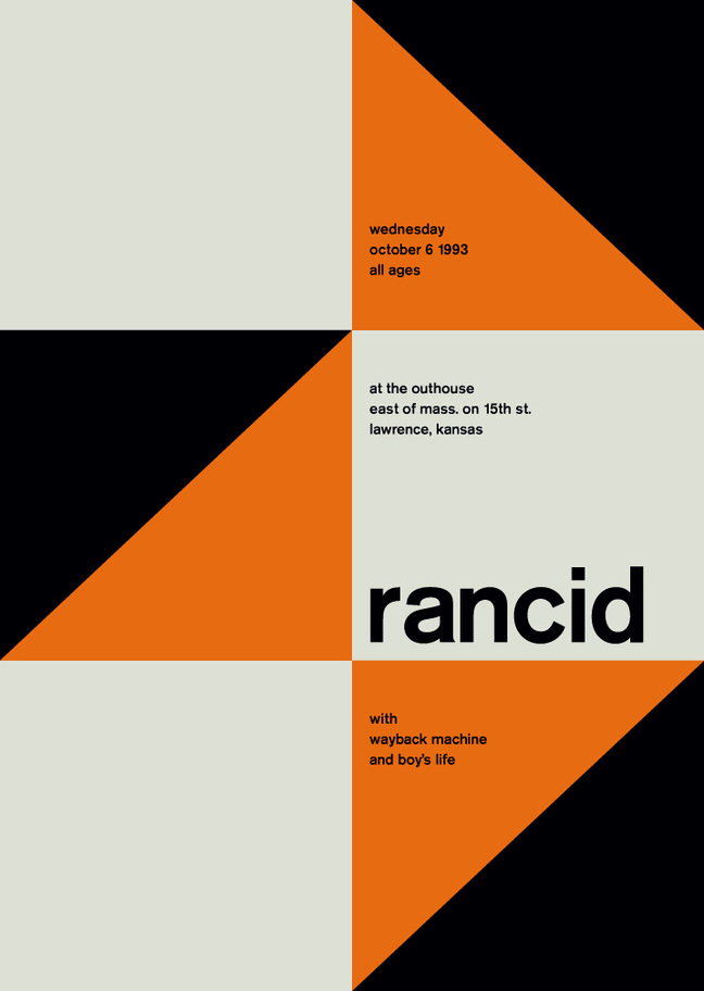
This tip is about breaking classical composition rules too. One major advantage of asymmetrical layouts consists in the possibility to efficiently shift a viewer’s attention towards an off-centered focal point. When you use the Swiss style, such an approach gives your work a more distinctive character.
Use only one font type
Typically, sans serif fonts are used with Swiss style posters as they have multiple winning features like a simple look, legibility etc. These classic fonts, if used properly, can make your poster text stand out. Feel free to experiment with character size and weight instead of adding other fonts to the same composition. This helps boost viewer experience while keeping the concept of minimalism.
Use photos
Prefer photo images over illustrations. This is another important feature of Swiss style designs. The reason is obvious: photography is the kind of tool that perfectly reflects reality, which complies with the general concept of this style. Consider adding photo elements to your composition to make the work look more objective.